Process of a painting: "Glen Gillard"
Early in 2013, Kay Kane- the President of The Royal Queensland Art Society (RQAS) made a proposal to its members to reinstate a tradition celebrating their previous Presidents. A commissioned portrait of the previous (and seminal) President Glen Gillard, would pick up the old thread. Artists such as Kay and Glen give so much of their time and energy in the role, and the commission would in a small way acknowledge their importance. The painting would become a part of the RQAS art collection.
I was proposed and accepted for the job.
The final painting (below) was presented to the RQAS in March 2014 at a ceremony for Members, where I extravagantly unveiled it from behind a purple silk curtain. This event was an opportunity for me to talk to the Members about the process that the project took. This blog summarises the presentation made that day.
This presentation I gave was to a group of painters, and therefore whats below is a little involved in the nuts and bolts of the trade. My descriptions might appear indulgent to the non-painter, or basic to an experienced artist.

The work for the portrait began with a few sneaky sketchbook drawings of Glen viewed from behind, during an RQAS meeting. These kinds of situations are great because subjects are absorbed in what they're doing and we can be voyeurs, studying them all we like.
In a second RQAS situation Glen was busy describing his Kokoda track experiences, and the paintings which developed from that. The drawing on the right most captures his character and physicality, from all which I made. The position of Glen's head at profile helped me later to figure out drawing issues, such as the depth of his features when painting the final picture.

From this point on studies were made in Glens studio, which gave us a lot of control with lighting and set up. The pen drawings below were experiments just to see around Glen's face, while trying to be open to a possible position or image, for the final work.

The next biro study is not a very sympathetic version of Glen- he is much friendlier than this! Still, somehow the likeness and characterisation in the drawing are still fairly good. This drawing became a model for a few more ideas discussed below.

By using chalk I had a chance to model form in a more immediate and fluid way. Its a little more unpredictable as a medium, but its those kind of graphic discoveries that make the drawing process a more exciting one. The drawing on the left distorts proportions to dramatise the lower vantage point. The next chalk study uses the pose and position of the earlier biro study, whose design of verticals and horizontals I thought could help make a stronger image. These drawings were fun because of their larger size and the more tactile drawing medium to get involved with. The latter was ruined and pushed too after the life drawing situation. It was my tinkering on it with other media, trying to develop enhance the design which made a huge mess.


In these quick, small thumbnail compositions the internal design of Glen's features extends into the whole format. In the left drawing Glen sits centrally with strong verticals and horizontals running through him. Diagonals in the lower part of the image help direct his left shoulder upward. The next idea was an attempt to repeat but distort his features, echoing the profile behind him. I thought it was possible to create a pulsing movement (back and forth/ small to large to small etc) between the smaller head which is more resolved and the expanding abstraction of it behind. These ideas didn't go anywhere, but they were fun little experiements.

It was this study that focused my preparation for the final painting. To be honest the likeness is way off- the head and nose are much too long. However as a drawing its one of the more successful from the series. The modelling which is achieved by graining and hatching was satisfying, alongside the more graphic treatment in the neck and collar. This rendering mix in this case works well I believe. It was the design within the features and bust that was memorable at that time, and which was developed further in the final painting. Specifically Glen's design involves a horizontal base, then a movement backwards as the A-shape of the collar, which interlocks with the wedge of the neck. The upward and outward movement continues, through the horizons of the face creating a deeper V-shape, concluding with the dome of his cranium.
There is a raising and opening movement to the image by these means, which might convey something spritely and outgoing in Glen's character.
Now feeling very clear about the direction the image should take, I made a few small colour studies from life to guide my later decisions about light and colour. The vessels behind Glen's head, which repeat his neck/head shapes were a possible addition. These are parallel to Glens head/ neck, so the atmosphere between them could have been interesting to paint for this subtle sense of space. Finally I decided they were distracting as well as awkward because of the way they appear to sit upon his shoulders. The second study on the right is more fluid, and the features more suppressed as subforms.
There were a few major ingredients that I tried to develop in the final painting. The first was an idea to enjoy a tight cropping around the subject. With the head awkwardly close to the top it would be an opportunity to find a way out of that situation ie. emphasising other areas. The scale is also above life size, which gave me room to work with some thicker paint, scumbling for much of the modelling and allowing room for sculpting around forms. .
I enjoy this mix between: the viewpoint in the image/ its relationship with the format/ compared to an over life size scale. Another way to say this is: the viewer of Glen is positioned close to him, from below/ Glen fills up the format, almost too large for the context/ his scale being physically over life size gives an interesting tension between those factors and creates a more looming effect. Viewed "in the flesh" the painting is more engaging and monumental for this set of relationships.
The central dark shape behind Glen's nose was a feature to exploit. I tried to keep it isolated and limited the modelling in the shadow zone. By leading in and out of this drake area by modelling, the surrounding subforms become intergrated.
As mentioned previously, the design was the most interesting aspect in the making process. By making all kinds of diagrammatic studies about the image, and exploring the diagonal, C and S-curve systems etc. all the parts became cohesive. As painters know, all these studies are trials which sensitise us, so the actual painting process becomes more confident and nuanced.

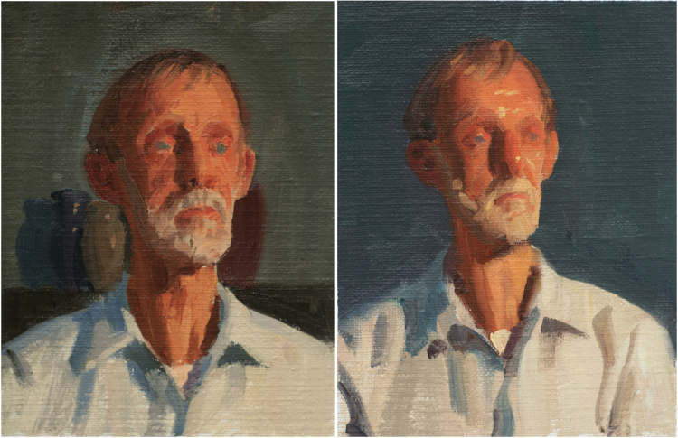
This quickly painted before/ after study was used as reference to help me to decide how to start the final painting and progress into full colour. This reference also helped me to decide what colours could be achieved when glazes in the shadows, and how the light areas can built texture for a more rugged sense of form. Unlike the previous colour sketches from life, there were no Cadmiums used in this study or the finished painting.
So with this reference pool the final painting began!
By working only from studies it helped to focus upon those initial ideas for the painting, which were so intense and motivating. This helped me deal with any distractions and keep the changes within certain parameters. Towards the end of the painting a few photos came in as reference, mostly to help understand Glen's features in the round, as well as to help refine the likeness and have more information for the beard.
The colour palette for the flesh includes: Lead White, Yellow Ochre, Permanent Rose and Mars Black.

Neatly, the above photoshopped series explains how the background was painted. Starting with a neutral ground I painted two dot series of pinks and greens, mixed with lead white, Permanent Rose and Viridian paints. This was all planned very clearly in mind, and the results were close to my original conception. The transition from bottom to top is lower to higher chroma green, also being lighter to darker in tone. The pink similarly was bottom to top- light to dark, high to lower chroma. At the final stage a glaze of Mars Black was layed on and wiped off again. This process selectively revealed the dots underneath. The optical mixing created in the background is a dynamic surface, against the opaque layers of flesh painting. Thee upward moving layers varying in hue, value, chroma become compressed under the glazed black and therefore support the dominant forms of Glens head. Even my initials were painted on the earlier dot layers and rubbed through.
The project ended up being a great excuse to paint flesh, pushing the materials further than I previously had. Subjects like Glen, with such character are fascinating to paint.
Thanks to the RQAS, its members, as well as Kay Kane and Glen Gillard. This was a great opportunity to be entrusted with.
Ryan Daffurn